Search This Blog

November 19, 2011

Test Results :: Jade Palace

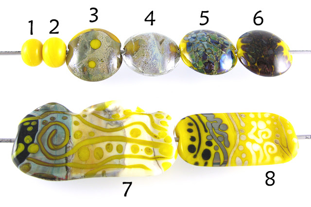
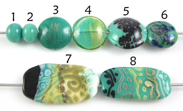
1 - Plain, 2 - Plain (reduced), 3 - w/ Silver Leaf, 4 - w/ Silver Leaf (reduced & encased), 5 - w/ TerraNova2 Frit, 6 - w/ Silver Glass Frit (reduced), 7 & 8 - w/ Tuxedo, Copper Green, Opal Yellow, Ivory, Peace

CiM Jade Palace is a medium, teal semi-opaque. It seems a little like it might be a lighter version of CiM Rainforest, however the reactions I got with Jade Palace aren't really all that similar to the reactions I got with Rainforest, so it is materially a different colour as far as I am concerned.


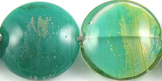
When silver leaf is used on top of Jade Palace, it disperses into a fine silvery mist. Underneath the silver leaf, the Jade Palace has struck to a darker version of itself, but I can't be certain whether this happened because of the silver or if it struck because of some repeated heating and cooling. I'm not sure how many times I pressed this bead, which doesn't really help any of us know for sure.

When I encased reduced silver leaf on top of Jade Palace, it turned decidedly gold. I believe I was using Reichenbach Crystal Clear for this test. You can probably see that the bead split in half along the mandrel line as well, which could be my fault, but also might be due to the differing viscosity between the Reichenbach clear and the Jade Palace because Reichenbach Crystal Clear is a very stiff colour, whereas Jade Palace is very soft and runny. I had a similar problem encasing Mulberry with Effetre 006 clear for possibly the same reason. The jury is still out.


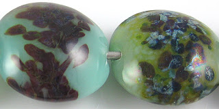
It looks like Jade Palace is a little nicer as a base for striking silver glass than it is for reducing silver glass. I got a great start to my strike in the TerraNova2 frit bead, but not a lot of magic happened there. In the bead with the reduced silver glass frit, the frit and reduction seems to have fumed the Jade Palace to a yellower, greener version of itself but the appearance of the frit is sort of smeary and lackluster.


Jade Palace does not do much in the way of reaction with Tuxedo, but it does some crazy things with the other colours I tested it with.

Copper Green
On top of Jade Palace, Copper Green separates into a reddish, shiny colour and a darker teal colour. A faint lighter line is visible around the edges of the Copper Green stringer and dots. I observed something silimar with Seafoam, however with Seafoam the lighter line was much more regular and pronounced than it is here with Jade Palace.

When Jade Palace is used on top of Copper Green, the greenish colour of the Jade Palace gathers in the centre of the dots and stringer lines, surrounded by a light turquoise line, all surrounded by a deeper, dark turquoise. This is a pretty neat reaction, however in the centre of the dots and stringer lines I also got some random sooting/blackening which sort of mars the overall effect.

Opal Yellow
Opal Yellow separates on top of Jade Palace and underneath it. The light yellow halos that pop up around Jade Palace stringerwork are very interesting and worth some playtime if you happen to have some of this colour. I like how the Jade Palace seems to forget that it is semi-opaque and looks very transparent over Opal Yellow.

Ivory
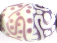
On top of Jade Palace, Ivory separates, gets a dark line reaction and curdles... ALL AT THE SAME TIME. The Jade Palace underneath stays more or less like itself, not getting all curdled the way Seafoam did. This is very similar to how Ivory reacted with Rainforest, although this reaction is quite a bit more dramatic than that one was.

On top of Ivory, Jade Palace turns into a darker, browner version of itself and spreads quite a lot, brown webbing spreading all over the Ivory. Underneath the Jade Palace, the Ivory curdles.

Peace
Peace separates on top of Jade Palace. When Jade Palace is used on top of Peace, the Peace separates underneath it, white halos popping up around the Jade Palace. The Jade Palace goes very transparent and a very dark line forms in the middle of the Jade Palace stringerwork.
November 12, 2011

Test Results :: Sea Foam

1 - Plain, 2 - Plain (reduced), 3 - w/ Silver Leaf, 4 - w/ Silver Leaf (reduced & encased), 5 - w/ TerraNova2 Frit, 6 - w/ Silver Glass Frit (reduced), 7 - w/ Silver Glass Frit (as stringer, encased in Clear), 8 & 9 - w/ Tuxedo, Copper Green, Opal Yellow, Ivory and Peace

As you can see in the picture above, CiM Sea Foam is a pretty reactive colour. It is a Limited Run, and seems to be an odd lot of Kryptonite, although the reactions I got with Sea Foam are far more intense than the reactions with Kryptonite were. Sea Foam is a little greener and a little brighter in colour than Kryptonite. I didn't order any of this colour (and have since sort of put myself on a buying freeze) but I really wish I had because I think it is a colour with a lot of interesting possibilities. I did get some Mint Lozenge, though, so here's hoping that one behaves similarly.

Like Kryptonite, Sea Foam is one of those rare blue/green colours that does not get a dark line with Ivory, it does all kinds of exciting things with other colours, and it gets really weird with reduced silver glass. All of these things make it really appealing to me.


On top of Sea Foam, Silver sort of fizzles out and turns yellow. Reducing and encasing the silver gives you a strange, lacy web under a layer of clear with some brown and yellow discolouration.  Neat, right?


Sea Foam is neat with silver glass. My TerraNova2 frit, although I didn't get the most vibrant strike out of it, has bloomed in interesting ways, and there is a hint of a yellow halo around the frit pieces. When I used reducing silver glass on top of Sea Foam, the Sea Foam turned noticeably more green in colour, and an oilslick of brownish yellow reaction surrounds the frit bits. The frit has also broken up and marbled in a very interesting way.  Yum.


It is possible that Sea Foam is one of the most reactive colours I have yet tested. You can see in the two beads above that while Sea Foam and Tuxedo have no reaction at all, the test results with Copper Green, Opal Yellow, Ivory and Peace are all crazy.

Copper Green
Copper Green on top of Sea Foam yields a rare three-ring reaction.  A light line forms around the Copper Green lines and stringer dots, and then the Copper Green separates into two distinctly different colours - a darker, shiny pinkish version of itself and a deep teal opaque version of itself. When Sea Foam is used on top of Copper Green, it breaks up and forces the copper green into a light turquoise vs. dark turquoise situation.

Opal Yellow and Ivory
Opal Yellow on top of Sea Foam separates into a dark, translucent yellow and a pale, ivory version of itself. The Sea Foam underneath it gets all kinds of strange cracquelure, which is visible in the Opal Yellow dots and stringer lines as well. This is similar to what happened when I used Opal Yellow with Ming. When the Sea Foam is on top of Opal Yellow, the same reaction happens in reverse, and the Sea Foam definitely looks more blue than green.

With Ivory, the reaction is exactly the same as with Opal Yellow except that the Sea Foam dots and stringer lines on top of Ivory look more aquamarine in colour than blue.

Peace
Sea Foam makes Peace separate into an opaque and translucent, both when it is under Peace and when it is over it. This reaction does not have the same kind of curdling craziness that the reactions with Opal Yellow and Ivory do.

I didn't really make anything fun with Sea Foam, but I think I still have a little bit. If I find it and something cool comes of that, I'll be back to do an update.

November 6, 2011

Test Results :: Marigold


CiM Marigold reminds me a lot of Effetre Butter Yellow, which is a particularly pretty variation of Effetre Yellow that doesn't have a lot of orange striation. Marigold is a bright, warm, happy colour.

Marigold also has a beautiful, soft, smooth consistency, is truly opaque, doesn't curdle or separate easily and is a little reactive.


Marigold reacts predictably with silver, in that the silver spreads out on top of it, turns the Marigold brown and turns brown itself. Silver tends to behave this way on top of all of the opaque yellow glasses I've tried. When the silver is reduced and encased, there are some faint streaks of blue in it, but apart from that it seems to just turn grey with a faint sheen.


My TerraNova2 frit on top of Marigold started to get some pretty nice colour in it. Around the frit, the silver glass creates a brown webby outline. This same brown ooze attacks the Marigold from the reduction frit in the bead on the right, but the reaction is more dispersed and engulfs the exposed surface of the Marigold. The reduction frit looks very interesting on top of Marigold, all of the different colours in my frit blend making themselves known, and I got good shine from reducing it.


Marigold is only moderately reactive, but there are a few reactions worth noting here:
  • Tuxedo bleeds into Marigold. This is visible on both test beads.
  • Marigold and Copper Green have a dark line reaction. Also, the Copper Green gets darker and sort of shiny.
  • Opal Yellow and Marigold have a dark line reaction.
  • When Ivory is used on top of Marigold, a bright yellow line forms around the Ivory, like the Marigold has uniformly bled into it all the way around the dots and stringer lines.
  • When Peace is used on top of Marigold, the same bright yellow line forms, and in addition the Peace seems to turn sort of translucent and almost look like it's set into the bead like a groove.
I didn't make anything fun with Marigold yet, but once I do I will be back to update this post.  I think that out of all the yellows I've tested, this might be my favourite one (although I am awfully fond of Hollandaise as well).

October 31, 2011

Test Results :: Evil Queen

Evil Queen is my 100th colour test. That sort of seems like a lot, yet there are more (maybe even a lot more) than 300 104 COE colours out there that I haven't even tried yet. Isn't it fortunate that being tasked with something that even I recognize to be impossible only makes me work harder?
1 - Plain, 2 - Plain (reduced), 3 - w/ Silver Leaf, 4 - w/ Silver Leaf (reduced & encased), 5 - w/ TerraNova2 Frit, 6 - w/ Silver Glass Frit (reduced), 7 - In Silver Glass Frit Stringer (encased), 8 - w/ Tuxedo, 9 - w/ Copper Green, 10 - w/ Opal Yellow, 11 - w/ Ivory, 12 - w/ Peace

CiM Evil Queen is the nicest opaque purple glass I have yet used. As luck would have it, it is also one the most expensive, trailing just behind Effetre EDP in terms of cost.

The consistency of Evil Queen is very soft, smooth and drippy.  Some of the other very soft CiM opaques have a noticeable 'stickiness' to them (e.g. Poi, Split Pea, Sherwood) but Evil Queen does not, although that is a pretty meaningless observation because the colours that do have that 'stickiness' are equally pleasant to use. In very thin layers or as hair-thin stringer, Evil Queen is slightly more on the semi-opaque side of opaque, so it's not an ideal colour for surface detail work.

Evil Queen does not devitrify, and pretty much stays where you put it on a bead. It is a little reactive, but in a gentle way, as opposed to the crazy reactivity I experienced with EDP. It does not turn a livery brown with repeated striking the way Effetre Dark Violet does, and isn't particularly streaky like Effetre New Violet or CiM Poi are.


Evil Queen does not change colour when silver leaf is added to the surface, and the silver leaf sort of fans out and balls up on the surface, creating a sort of mist of silver spray. When the silver is subsequently reduced and encased, it gets some blue highlights and forms a solid, matte armour-like coating over the core of Evil Queen. I think the yellowing that we can see in the bead on the right is due to a reaction between the Clear and the silver, and is not attributable to the Evil Queen.


Silver Glass on Evil Queen isn't very exciting. My TerraNova2 frit stubbornly refused to strike, although the light purple halos that sprung up around it are very neat. The reducing silver glass frit on top of it just looks kind of mottled and sad, but it is kind've intriguing how reducing the silver glass made the Evil Queeen underneath take on a shiny, purple iridescence. When I used Evil Queen with silver glass frit in frit stringer, wrapped that around a core of Evil Queen and then encased it, I got a little bit of interesting streakiness, but Evil Queen is just not reactive enough to really succeed with this technique.


Evil Queen and Tuxedo are mutually reactive. When Tuxedo is used on top of Evil Queen, the Evil Queen rises up around the Tuxedo dots and stringer lines and forms a lighter purple outline around its edges. When Evil Queen is used on top of Tuxedo, it separates, developing a dark, translucent purple line in the middle of stringer lines, and the edges of the stringer lines and dots look a little hazy on the left side of this bead.


The combination of Evil Queen and Copper Green doesn't really result in a lot of reactivity, but a couple of things sort of spark my interest here. First, the Copper Green develops a bit of a sheen. On the left side of the bead where the Evil Queen is over Copper Green, the Copper Green looks sort of vibrantly turquoise, but has also sheened up, taking on a dreamy, mottled appearance. On the right side of the bead where Coper Green is over Evil Queen, the Copper Green does not have that vivid turquoise colour, but does seem to have spread a little and is definitely somewhat shiny.

On the left side of the bead, you can see how the dots and stringer lines of Evil Queen have separated gently, and a darker line of purple runs through the stringer lines. The edges of the Evil Queen dots and stringer lines seem a little blueish and indistinct.

Opal Yellow and Evil Queen are both soft, spready colours, so it was not very surprising that I experienced some spreading of the dots and stringer lines on both sides of this bead. On the right side, where Opal Yellow is over Evil Queen, the edges of the Opal Yellow are sort of indistinct and have a somewhat violet hue to them. On the left side, where Evil Queen is over Opal Yellow, the Evil Queen has also spread a little, and has also separated into two different shades of purple, a thickish, lighter line forming around the edges of the dots and stringerwork. Neat.


Ivory spreads out a little on top of Evil Queen, and my Ivory stringer lines and dots also have a curdled, mottled appearance. On the left side of the bead, the Evil Queen dots all have a lighter purple outline and faintly darker centre. Their edges are also a little cloudy and indistinct.


Over Peace, Evil Queen seems more of a semi-opque than an Opaque. Peace spreads on top of it, and you can see in the centre of the bead how the Evil Queen has bled into the Peace turning it a purplish blue colour.

I didn't make any real beads with Evil Queen, but I am sure that I will revisit this colour. When I do, I will come back and update this post with some pictures.

October 23, 2011

Test Results :: Sunshine

1 - Plain (reduced), 2 - Plain, 3 - w/ Silver Leaf, 4 - w/ Silver Leaf (reduced & encased), 5 - w/ Silver Glass Frit (reduced), 6 - w/ TerraNova2 Frit, 7 & 8 - w/ Tuxedo, Copper Green, Opal Yellow, Ivory and Peace

Vetrofond Sunshine is a vibrant, pure yellow. It reacts in ways that I consider predictable for an opaque yellow glass and while the rods can be a little shocky, and if you get it too hot it boils, it is not an unpleasant colour to use.

One of the tricky things about Vetrofond Sunshine is how grainy it is when it's hot. It's a hard colour to get good coverage with in thin layers, making dots and stringer lines of it on top of other colours sort of mottled and untidy.


Silver spreads out on top of Sunshine and turns a silvery brownish colour, keeping its shine. The Sunshine underneath fumes a deeper, brownish colour. I put additional dots of Sunshine on top of the silver in the bead on the left, and they stayed mostly yellow, but do have a greenish tinge to their edges and have a distinct line around them where the silver has grudgingly given way. In the bead on the right, the reduced and encased silver has taken on a sort of ethereal bent on top of the Sunshine, turning faintly blue and pink in places. If the ethereal pink and blue covered the whole bead, it would be attractive. If that is achievable every time with more careful application of the silver, that would be pretty neat. More experimentation required.


On top of Sunshine, I got really nice colour and coverage with my reducing silver glass frit, and a nice variety of blues and greens popping. In the bead on the right, my TerraNova2 frit is largely unspectacular, although I did get some colour here and there. This is a colour that seems to be a better base for reduction colours. If only it weren't yellow.

On top of Tuxedo, Sunshine looks sort of livid and splotchy. Tuxedo dots and stringer lines on top of Sunshine cause a little activity in the Sunshine underneath and receive a faint yellow outer ring.

Copper Green and Sunshine have a reciprocal dark line reaction. When Sunshine is used over Copper Green, that dark line is brown and spready, engulfing and transforming most of the Sunshine dots and stringer lines so that they look more brown than yellow. When Copper Green is used over Sunshine, it develops an army green shiniess and a black outline.

Something about using Sunshine with Opal Yellow made my Opal Yellow do some very strange greying things, in both of the test beads.

There is not much in the way of reaction between Sunshine and Ivory, but when Sunshine dots and stringer lines are made on top of Ivory, the yellowness of the Sunshine seems to creep into the Ivory, leaving what is left of the Sunshine looking more of a mustard colour and making the Ivory seem more yellow. The same effect in reverse is visible when Ivory stringer dots and lines are placed over Sunshine.

Peace and Sunshine also seem mutually reactive, but there are multiple things going on so it's hard to describe. The Peace seems to separate, both when Sunshine is on top of it and vice versa, but the two colours in combination also cause some greying/blotchiness. It's not attractive, so I'm not bothering to analyze it further.

Here are some fun rainbow beads with Sunshine. Apart from hiding it in vine cane, the only thing I can ever really think of to do with a yellow this bright is to put it into rainbow beads. When I make rainbow beads with an opaque yellow in them, I need to be careful because yellows, like Ivory, don't usually react particularly nicely to greens. To proactively solve this problem, I encase my Sunshine with Reichenbach Mystic Yellow, which is a yellow translucent that does not have that problem.

October 17, 2011

Test Results :: Strawberry

1 - w/ Silver Leaf, 2 - w/ Silver Leaf (reduced & encased), 3 - w/ Silver Glass Frit (reduced), 4 - w/ TerraNova2 Frit, 5 - Plain, 6 - w/ Plain (reduced), 7 & 8 - w/Peace, Ivory, Opal Yellow, Copper Green and Tuxedo

Reichenbach Strawberry (RL6213) is a bright, cherry red opaque that has just the slightest bit of translucency to it. I didn't really like working with this colour, because as you can see in the beads above, it tends to grey up with repeated striking. All of the smaller beads I made are fine, but the larger ones look just terrible. I didn't do enough experimentation to really get a feel for how to control the greyness.

This is an awfully pretty colour of red if you can figure out how to make it stay red, and it does have some interesting reactive properties.


Strawberry turns black where it meets silver leaf, and the silver leaf in the bead on the left has a grainy, webby consistency to it that is rather attractive. Reducing and encasing the silver removes some of the texture and doesn't really add anything nice to the effect. The silver over Strawberry after encasement looks a little like the surface of the moon.


Silver glass frit doesn't really do very well on top of Strawberry. A black line develops around the edges of the frit and sort of overwhelms it. In the bead on the left, I got some nice blues and turquoises where the black did not completely engulf the silver glass, but my TerraNova2 frit bead just looks kind've sad and yucky.

Strawberry has some interesting reactions with other colours, although they are not easy to read here because the Strawberry, in a lot of places, has turned almost completely a uniform dark grey colour. However, even through this yucky grey, some reactions are evident:
  • Copper Green separates slightly on top of Strawberry, developing a thin, dark green line down the centre of stringer lines and faint translucent halos inside dots.
  • When Strawberry is used over Opal Yellow, it causes separation in the surface of the Opal Yellow and a thin yellow line rises up from the Opal Yellow to surround the Strawberry stringer lines and dots.  When Opal Yellow is used over Strawberry, it separates very dramatically, and spreads out, curdling around the edges.
  • When Strawberry is used over Peace, it causes separation in the surface of the Peace and a thin white line rises up from the Peace to surround the Strawberry stringer lines and dots. This reaction is less dramatic and less consistent than the same reaction with Opal Yellow. Peace separates on top of Strawberry, developing a thin dark line/dot in the middle of stringer lines and dots.
  • Ivory curdles underneath Strawberry. On top of Strawberry, Ivory stringer lines and dots get jagged edges around them and develop fine, translucent centre lines/dots.
Here is a fun rainbow bead with Striking Red-encased Strawberry.
 

October 13, 2011

Test Results :: EDP (Evil Devitrifying Purple)

1 - Plain, 2 - Plain (reduced), 3 - w/ Silver Leaf, 4 - w/ Silver Leaf (reduced & encased), 5 - w/ Silver Glass Frit (reduced), 6 - w/ TerraNova2 Frit, 7 - w/ Tuxedo, 8 - w/ Copper Green, 9 - w/ Opal Yellow, 10 - w/ Ivory, 11 - w/ Peace

Effetre Purple, most commonly known as Evil Devitrifying Purple (EDP), is a very strange colour. The reactions with EDP and other colours are strikingly similar to the reactions I got with Reichenbach Flamingo. This is a very reactive colour. It is also a very frustrating colour because of its tendency to devitrify, turning matte and white in odd ways and places.

What I think I've discovered about working with EDP is that it is important to work it hot, and to not let it cool too much before finishing the bead. Cooling the surface of the bead -- by waiting outside the flame, by pressing -- and then reheating it seems to be what caused me the most devitrification headache. Keeping the bead pretty hot and cooling it only once, at the end on it's way to the kiln, is what helped me keep the devitrification off of these test beads. Where I did get some, I reheated the bead and got rid of it and put the bead away fast before my luck changed.

I find that when I work on large focals with EDP or Sedona (it devitrifies too *sigh*) that I usually just end up either etching or encasing the bead because I get discouraged once the bead is well and truly devitrified. I learned from Kimberly Affleck that you can reduce the devit off in a dragon's breath flame, but sometimes I don't really want to reduce my bead, and as you will see below, reducing EDP can have some unpleasant effects.

Here we have two plain spacers made from EDP. The one on the left is a rich purple with hints of blue. The one on the right was reduced, and is now a shiny, brownish purple. I did not know that EDP did this when it was reduced, so it was an interesting surprise.


EDP and silver don't really seem to like each other very much. You can see in the bead on the left how the EDP has sort of gone haywire under the silver, getting all pink and yellow. The silver leaf on top of the EDP has a strange greenish orange cast to it. When the silver is subsequently reduced and encased, almost every interesting thing that silver and EDP do together is no longer evident, the silver just looking like a dirty white shell over the mottled purple core of the bead.


Here, in the bead on the left, the EDP has turned almost all of the reduction fritty bits yellow. Underneath the frit, the EDP has turned pinkish and yellow (from the silver) and brown (from the reduction). In the bead on the right, my TerraNova2 frit sort of stubbornly refused to strike, and all around it, the EDP has turned pink and coral.

On top of Tuxedo, EDP looks blue and cloudy.

EDP makes copper green separate into two different colours of turquoise, and seems to prevent the copper green from getting that greyish sheen. The EDP is sort of mottled in this bead, looking like itself in some places and looking bluer and cloudier in others. This is an awesome reaction, and if you are familiar with the classic EDP/Copper Green/Opal Yellow colour combination and are looking for other colours that will work, I'd start by looking for other colours that do this to Copper Green. 

A few opaque colours that I have found so far that have this kind of dramatic reaction include Lauscha Olive, Lauscha Steel Blue, Lauscha Cocoa, CiM Rainforest and Reichenbach Flamingo. Of course, I have not tested them in combination with both Copper Green and Opal Yellow, so I don't know what the final result would look like, but these all seem like they'd be good ones to experiment with.


This is the yellowest yellow I have ever achieved with Opal Yellow, although Opal Yellow has behaved strangely with all of the same colours that have made Copper Green go crazy. In this bead, the EDP is a mottled pink and purple, and has formed a sort of pinkish brown line between itself and the Opal Yellow. The Opal Yellow, apart from being a lot yellower than I would have thought on the left-hand side of the bead, has also separated and developed purple dots in the centres of its dots where I've put it on top of EDP. Fun!


Weirdness with Ivory, again in almost exactly the same way Reichenbach Flamingo was weird with Ivory, turning it black. EDP looks sort of blueish on top of the blackened Ivory, in the same cloudy way that it looked blue on top of Tuxedo. The Ivory lines and dots on top of EDP look black, but in a strange pencil-lead kind of way that makes them look sketched on instead of painted on.


On top of Peace, EDP looks almost pink, and spreads a little. Peace on top of EDP separates, and all of the dots and stringer lines get a dark, translucent purple centre.

Here are some fun beads with EDP.


In all of the crunched beads, I used a cane that I made from EDP, Light Turquoise, Celadon and Iris Dense Blue. All of the orange you see in the beads is from a reaction between the EDP and Iris Dense Blue. The unencased bead (bottom left) devitrified pretty heavily, but you can't see any devit in the two beads I encased, and I rather like the resulting mottledness.

October 8, 2011

Test Results :: Candy Corn

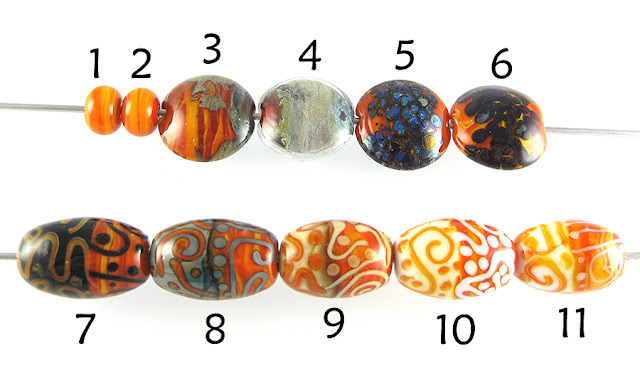
1 - Plain, 2 - Plain (reduced), 3 - w/ Silver Leaf, 4 - w/ Silver Leaf (reduced & encased), 6 - w/ Silver Glass Frit (reduced), 6 - w/ TerraNova2 Frit, 7 - w/ Tuxedo, 8 - w/ Copper Green, 9 - w/ Opal Yellow, 10 -w/ Ivory, 11 - w/ Peace

Rods of Candy Corn are orange on the outside and have what seems to be a core of White running through them. What this translates to in a bead is a streaky orange that ranges from a pretty light orange to a dark, tomato colour.

Candy Corn, like the other Vetrofond veiled odd lots, can be a little annoying to work with. It's not as bad as Honey Crunch or Avocado Marble, but some of my rods did have that problem with cracking off every few inches while I was working.


On top of Candy Corn, silver leaf gets a yellowish, crusty look to it, and causes a bit of a dark line reaction between it and the Candy Corn, otherwise pretty much staying put. When the silver is subsequently reduced and encased, it turned back to silver except for some patches that either stay yellowish or develop a blueish tint.


My reducing silver glass looks bluer on top of Candy Corn than it has on top of other colours, but I have been using the same blend for most of this year. The silver glass on both beads has a very distinct black border around all of it's little fritty bits. The TerraNova2 frit in the bead on the right didn't really get off the ground in terms of striking.


No reactions to see here, really, but it is interesting how on the Tuxedo side of the bead the Candy Corn stringer lines have a light outline. I think this is from the streakiness of the glass, and I like how that streakiness translates into a textured look in the stringerwork.


Candy Corn and Copper Green develop a mutual dark line reaction. Again, the Candy Corn stringer lines have a beautiful streakiness that makes them look almost three dimensional, or like they've been intentionally shaded.


On top of Ivory and Peace (much more so on top of Peace), Candy Corn spreads a little and because of its streakiness, has some interesting things going on. Peace separates and develops a thin, translucent line down the middle on top of Candy Corn.

I've taken some short cuts here, but Candy Corn just isn't a very reactive colour. The streakiness is fun though, and I can't wait to work with the other Vetrofond odds that are languishing in my glass box.

Here's a fun bead with Candy Corn.